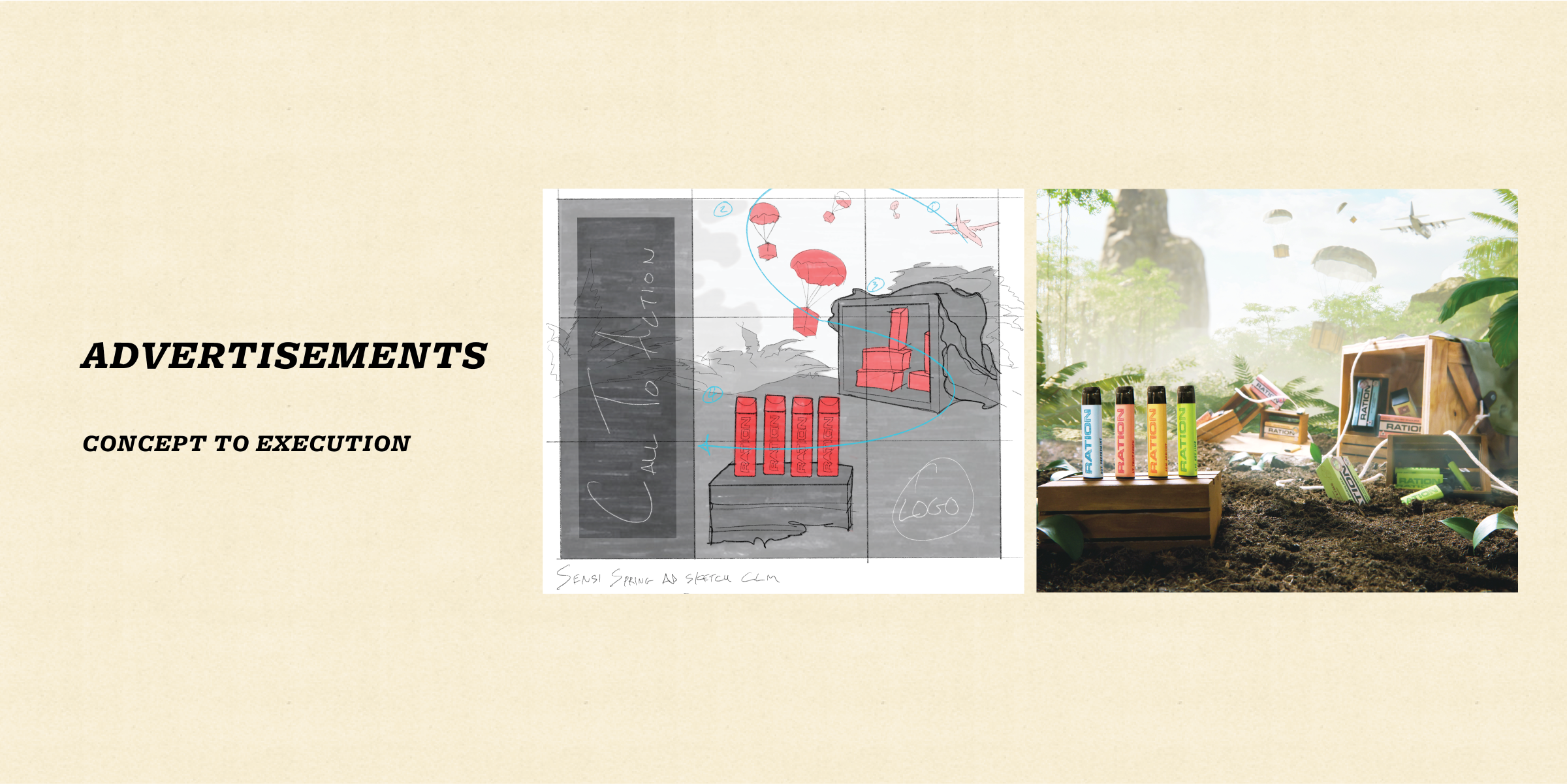
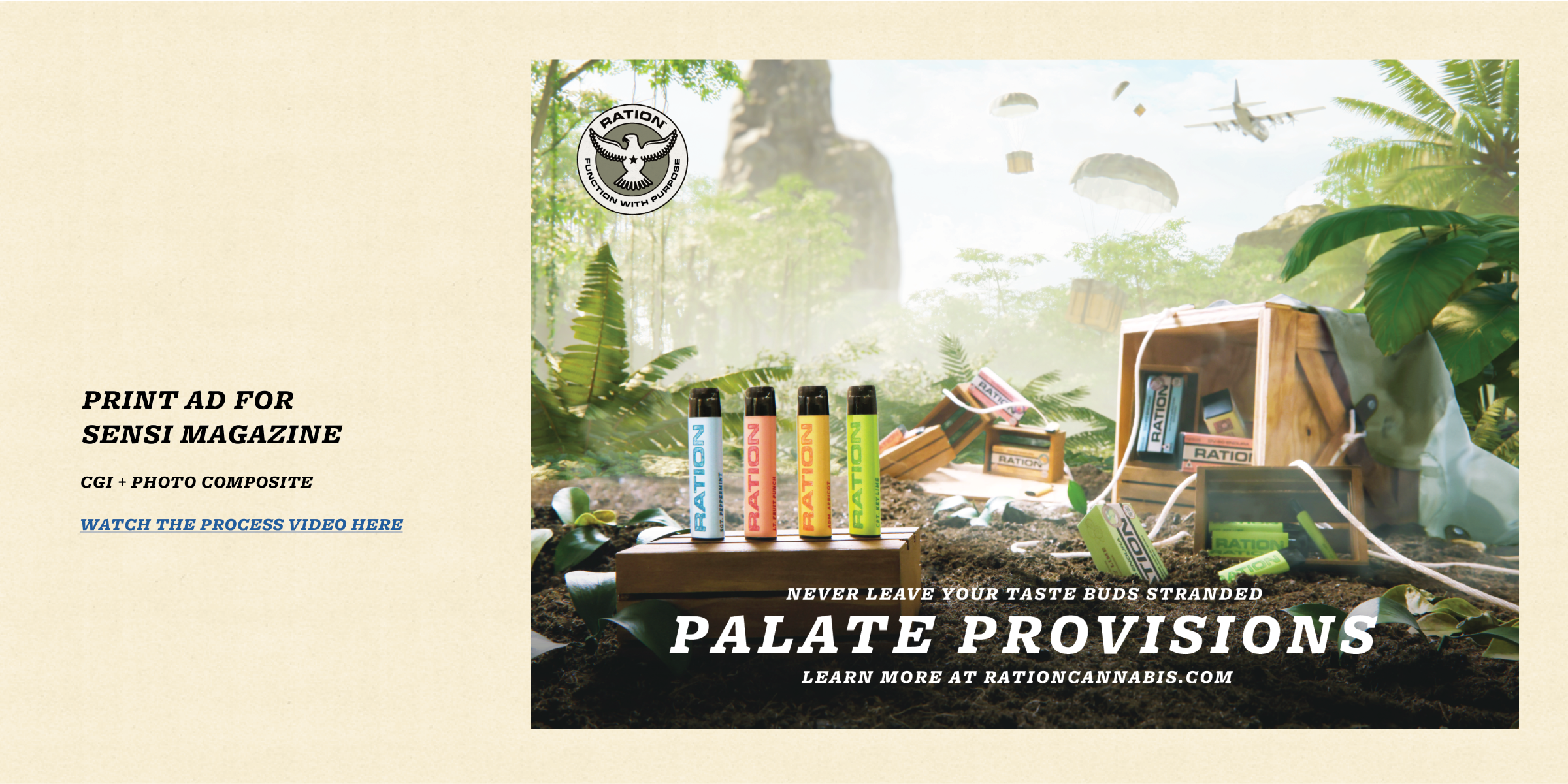
Ration’s palate provisions
new product line | Brand identity + Marketing support
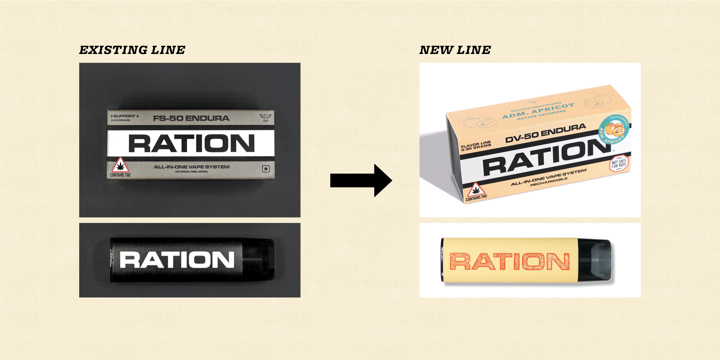
Ration Cannabis has an overarching theme abstracted from US mid-century military. Outside of this, branding was focused entirely on its first product line. The existing series was “effect-based”, and was visually depicted in a very serious, hard-line, and darker manner.
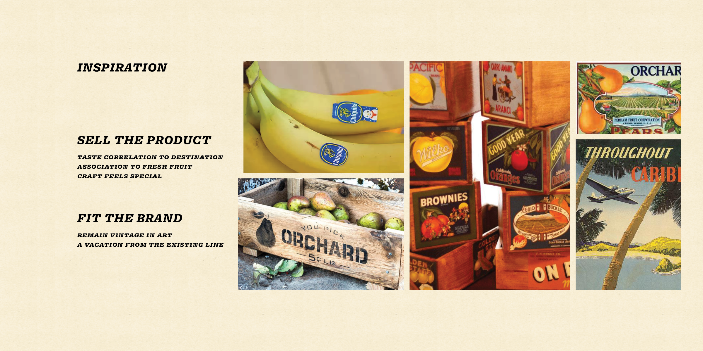
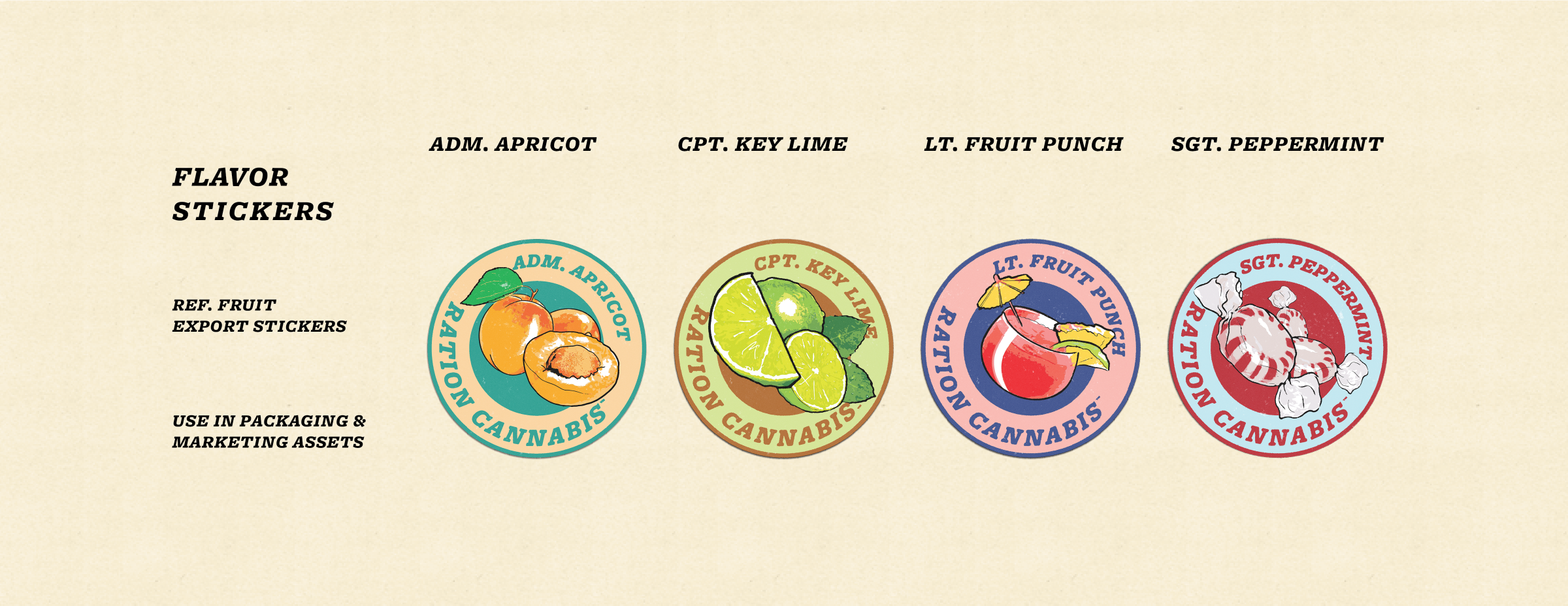
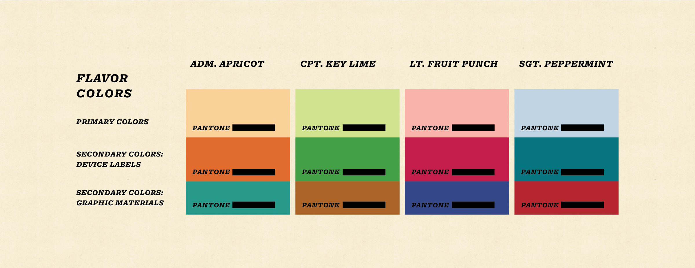
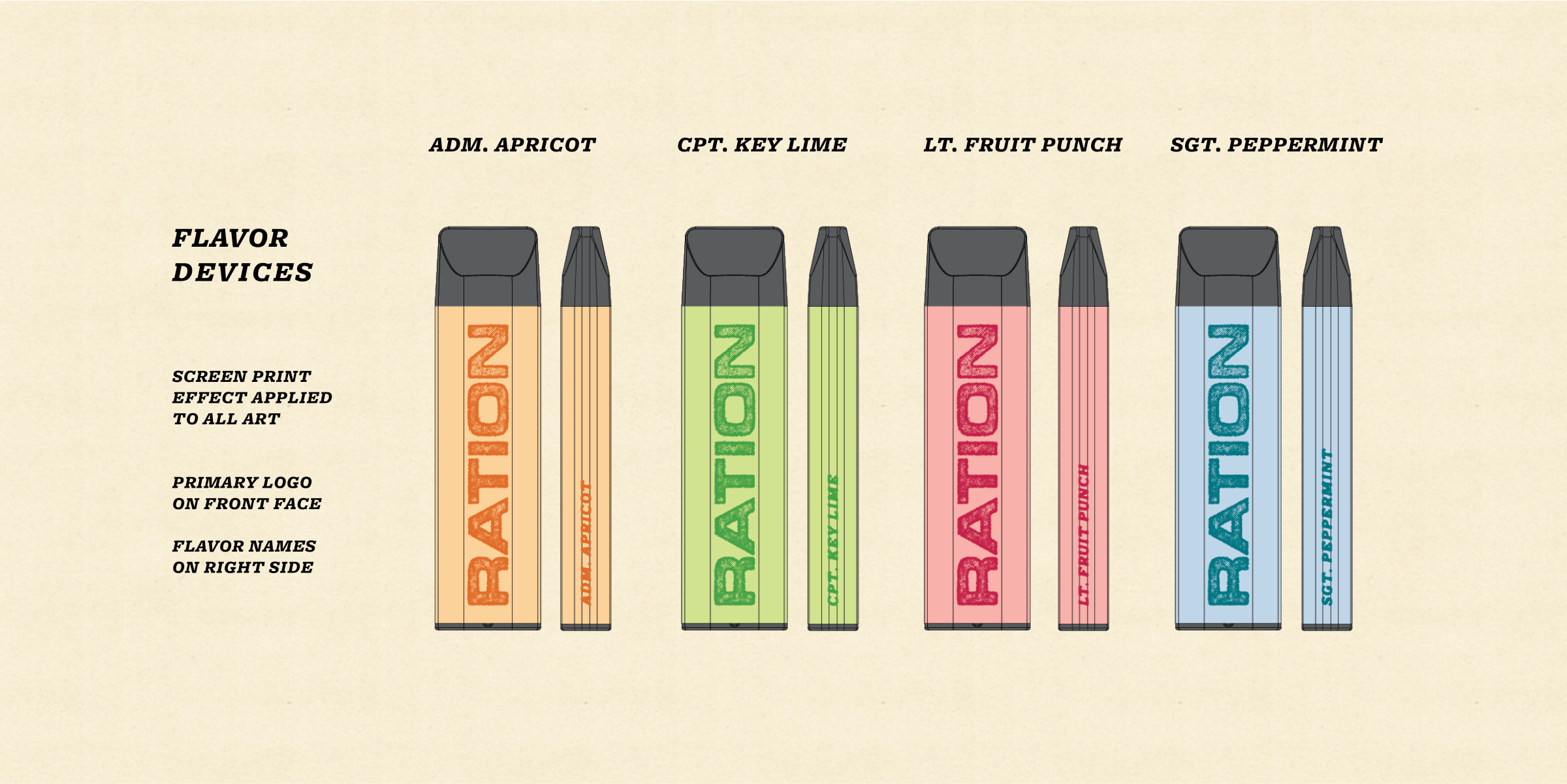
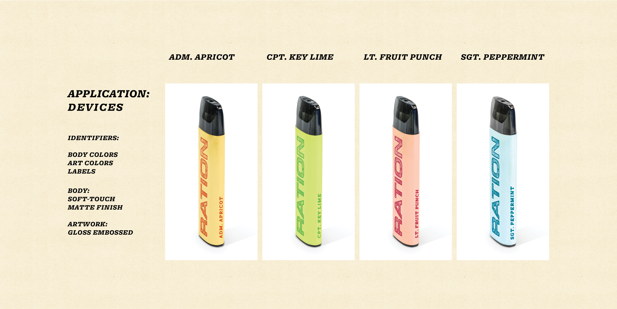
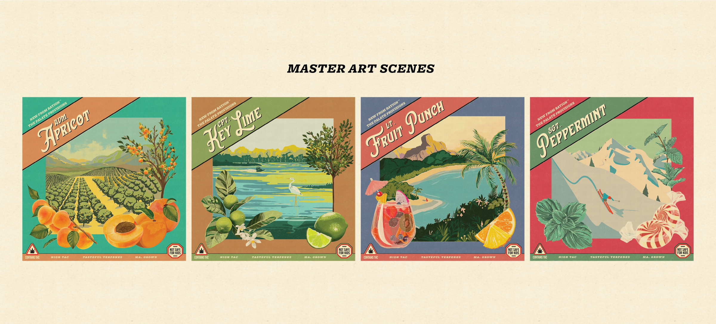
The new series focuses on flavor instead of derived effects. The new product line targeted a different audience and needed to be more fun and inviting, while still fitting into Ration’s core narrative.
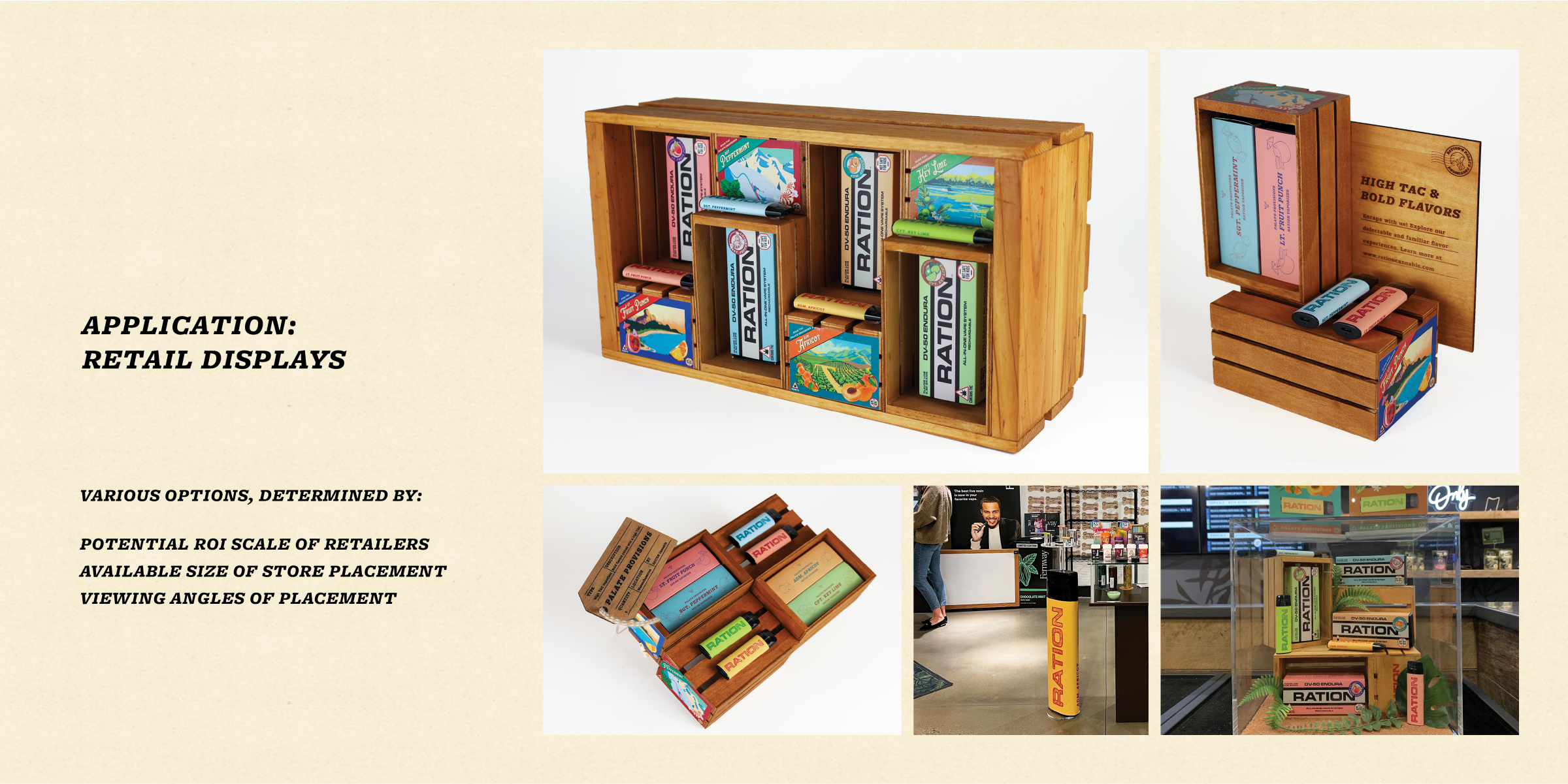
Naming, device art, packaging, retail displays, dispensary print collateral, OOH advertisements, event sizzle reels, and plenty more.
Keep exploring the site >
