Holo | Brand Identity
Problem: The cannabis industry focused on 45-60 year-olds based on outdated information.
Reports from the early days of cannabis legalization show 45+ year-olds to be the primary consumers. Studies would suggest that this is due to legal market prices being initially too high for the younger age groups, and as many have been consuming prior to legalization, they have existing illicit market dealers that supply product at a lower price.
As legal markets mature, prices decrease, thus becoming more accessible to (legally) younger consumers, i.e. those 21-30. As this happens, the illicit market shrinks, again driving more consumers to the legal market. How can we attract this market segment, on the west coast?
Packaging
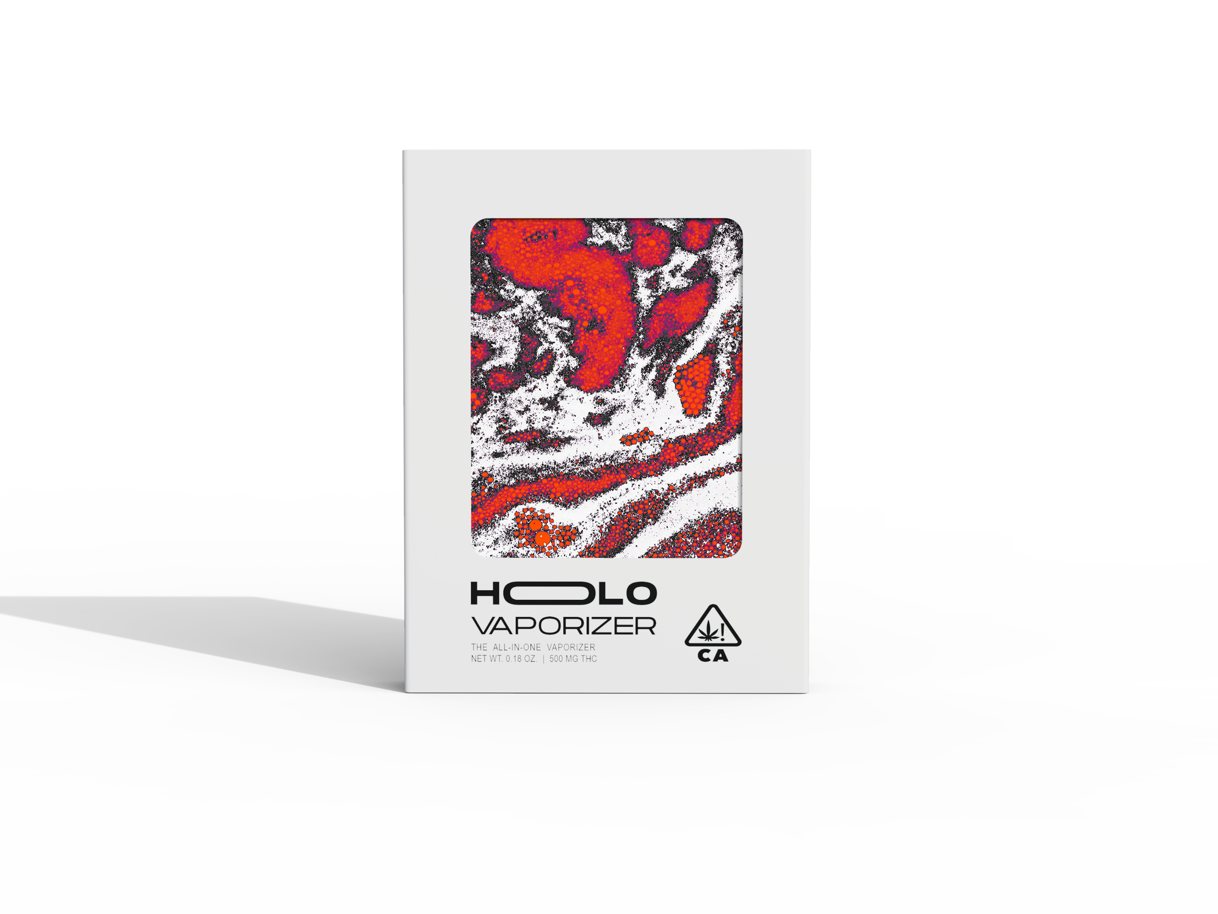
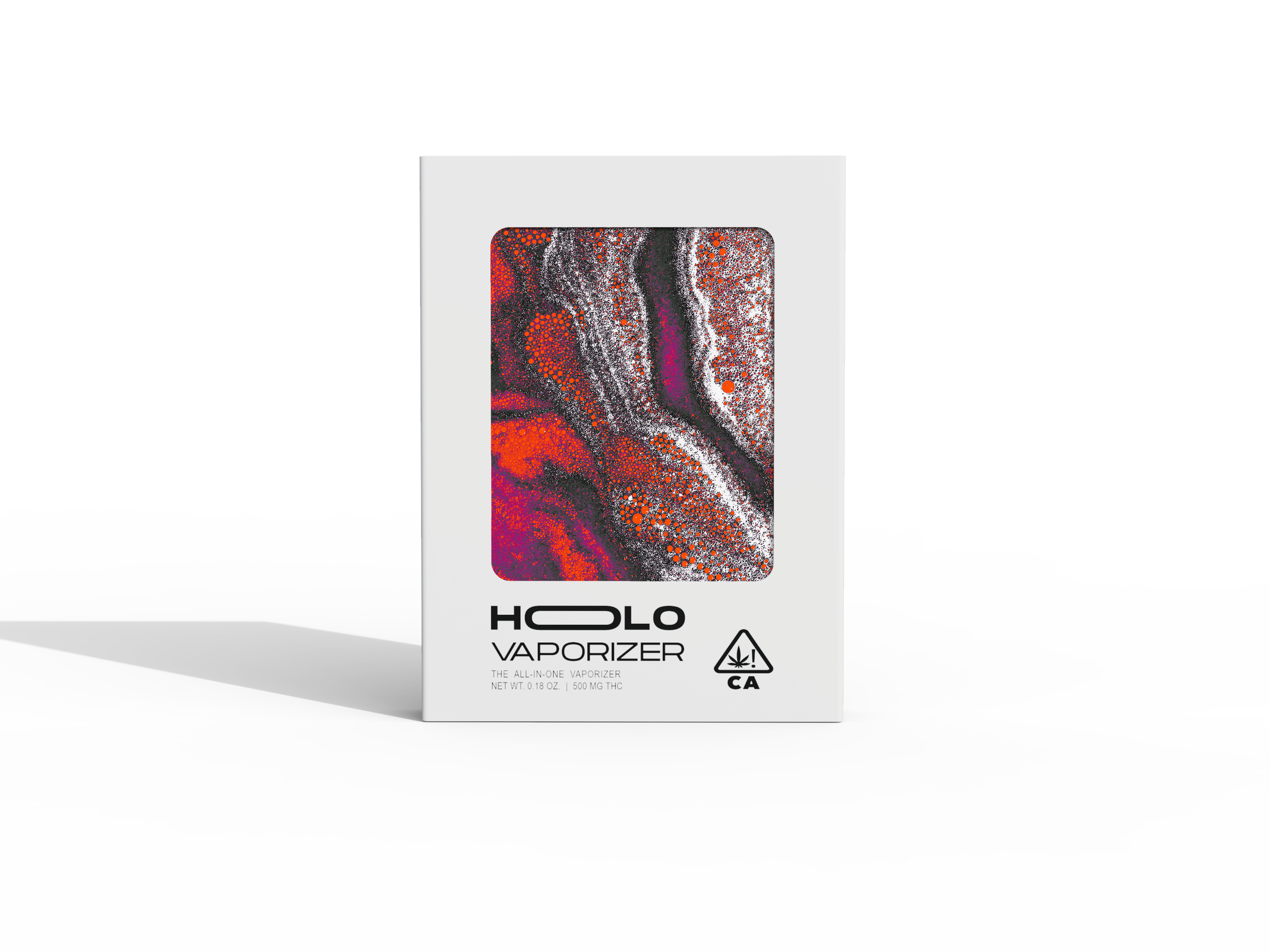
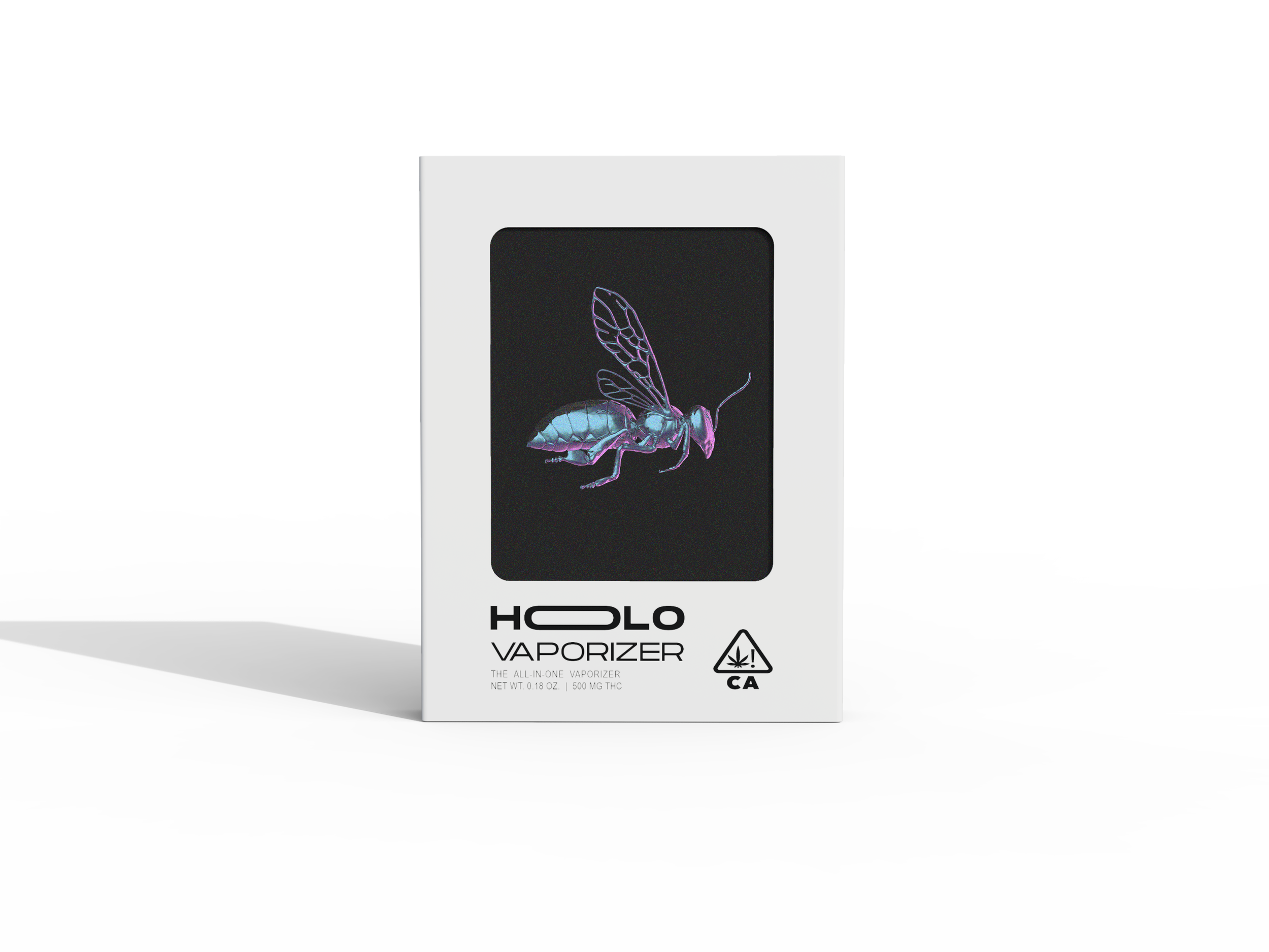
A “limited-release” scarcity model was utilized. Different artworks were released with every drop in order to stay culturally relevant. For reference think Air Jordan©, or Supreme©.
An outer sleeve, and inner trays were the same for every product, retaining consistency, drastically reducing order cost, and promoting increased order size.
An insert card, visible on the primary face, was used to differentiate between different releases. In larger releases, this was an extremely inexpensive article to order from the factory, and in more exclusive low-volume releases this article could easily be obtained locally from print-on-demand companies, as basic as Staples©.
Initial Devices
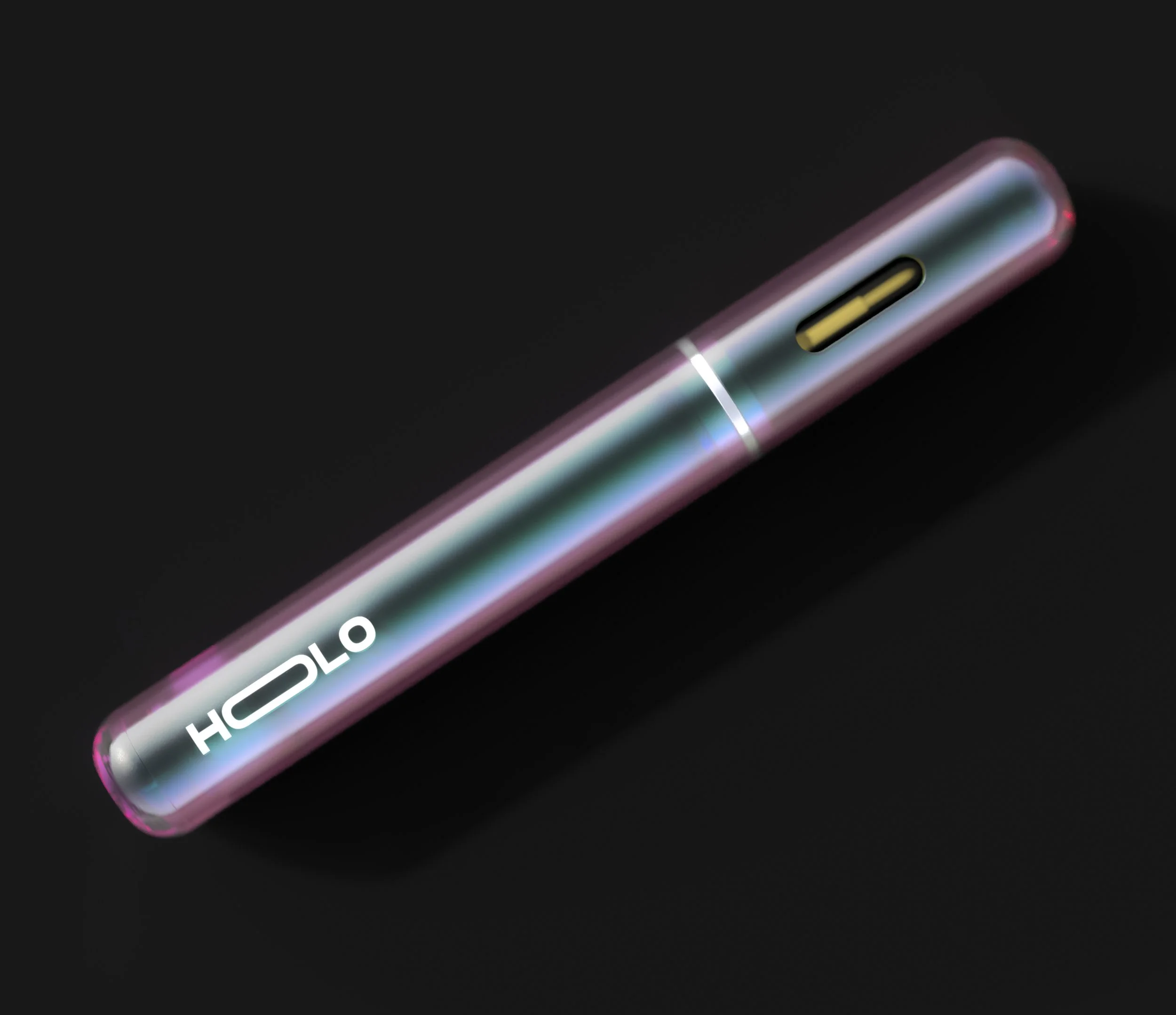
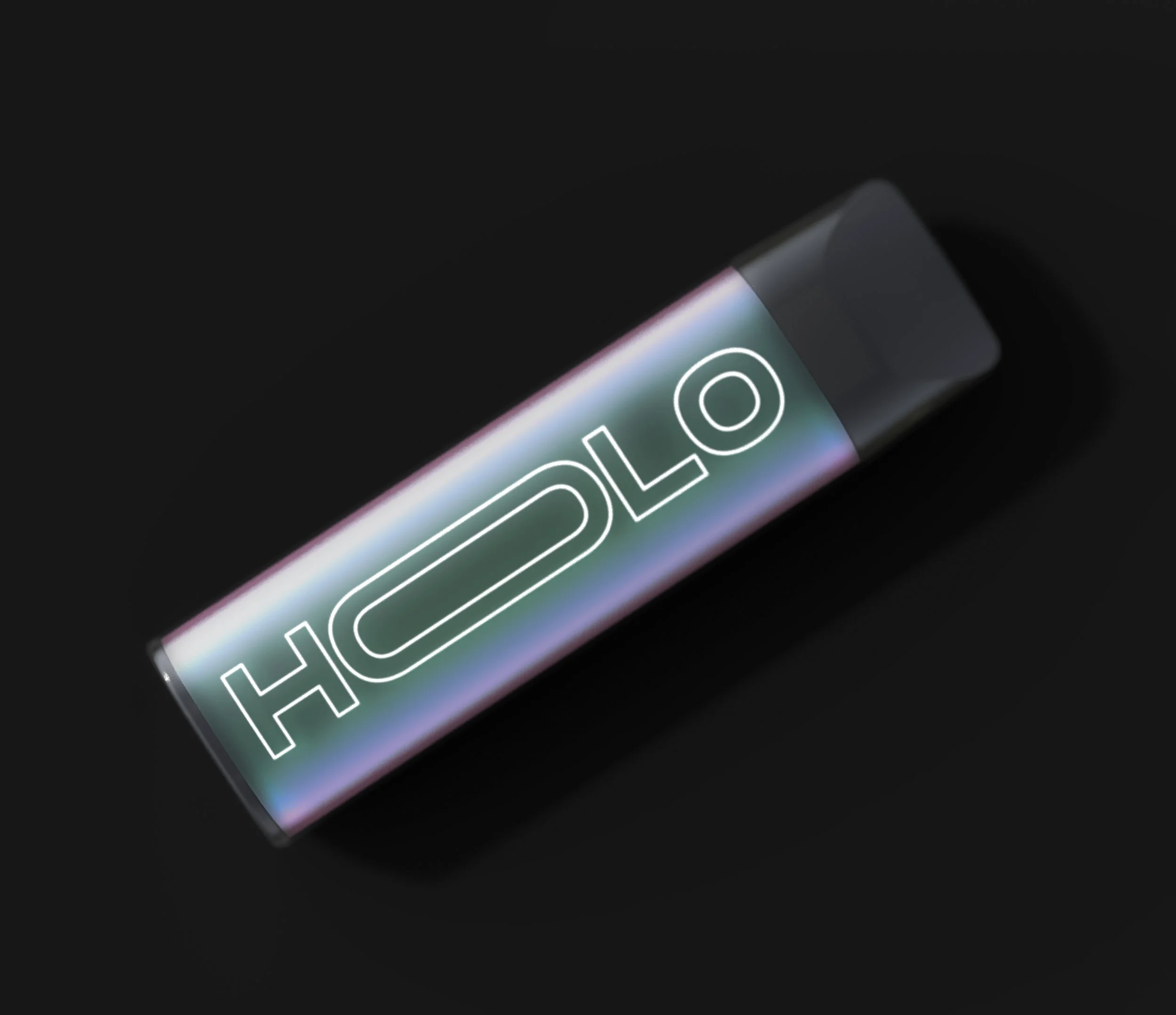
The name Holo comes from, holographic, which the client saw as iridescent. The first round of films were decided upon post-factory feedback.
process (Abv.)
Mood boards
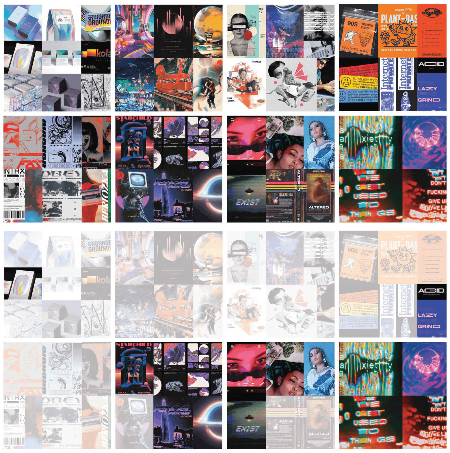
The client had many initial requests based on their interpretation of trends in other consumables and in illicit market visuals. I combined their stated preferences with my knowledge to come to initial mood board directions looking at: futurism, grunge, nostalgia, iridescence, and distortion.
How can we make a mix of so many things work?
Steering clients in a direction is often times the correct solution, but why not try.
Sure enough, things were getting messy. But some directions started to blend together…
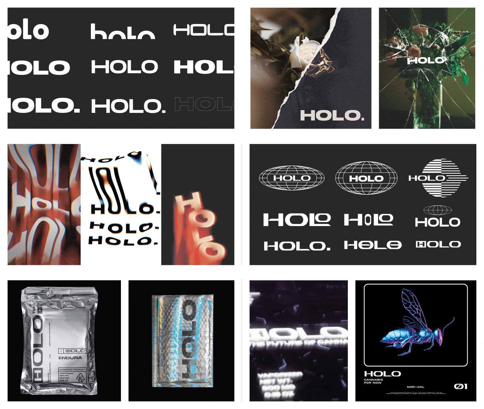
I started to think about the brand like a fashion company, where artwork could change out seasonally to be quite different, as long as the essence of the brand remained.
The logo still remained an issue. It couldn’t have too much personality as to overpower the artworks, but it needed personality. Ask me about the phonetic rational.
